Friday, October 28, 2022

Yeah But Is It GWARt? Part IV

Another Friday, Another Batch Of Dum Dum's GWAR-ITIATIVE Paintings With Commentary From Le Artiste~. While her artwork of the MASTER might be my favourite of the bunch, a close second would definitely be SEXECUTIONER. The expression, the border/background, it just shows the absolute Euphoria of getting a French brain transplant. 

This Monday she will be handing over the GWAR-ITIATIVE to the Scumdogs Of The Universe themselves. Finally this portion of her artist journey will be complete as a new dawn begins. What path will she carve out? Better follow her on Instagram and FIND OUT.

The next post will be the FINALE of this series but you can look out for an upcoming Artist Interview Two Parter I will be releasing on here which features Dum Dum among a handful of others.


SLYMENSTRA: 
I feel so bad I made Danielle's head a circle. Hair shading gets weird 
in a way I can't really describe. Maybe crunchy? I like the wet on wet 
for the fire background. The bloody tampons were a good choice for 
a border, they always make me laugh.
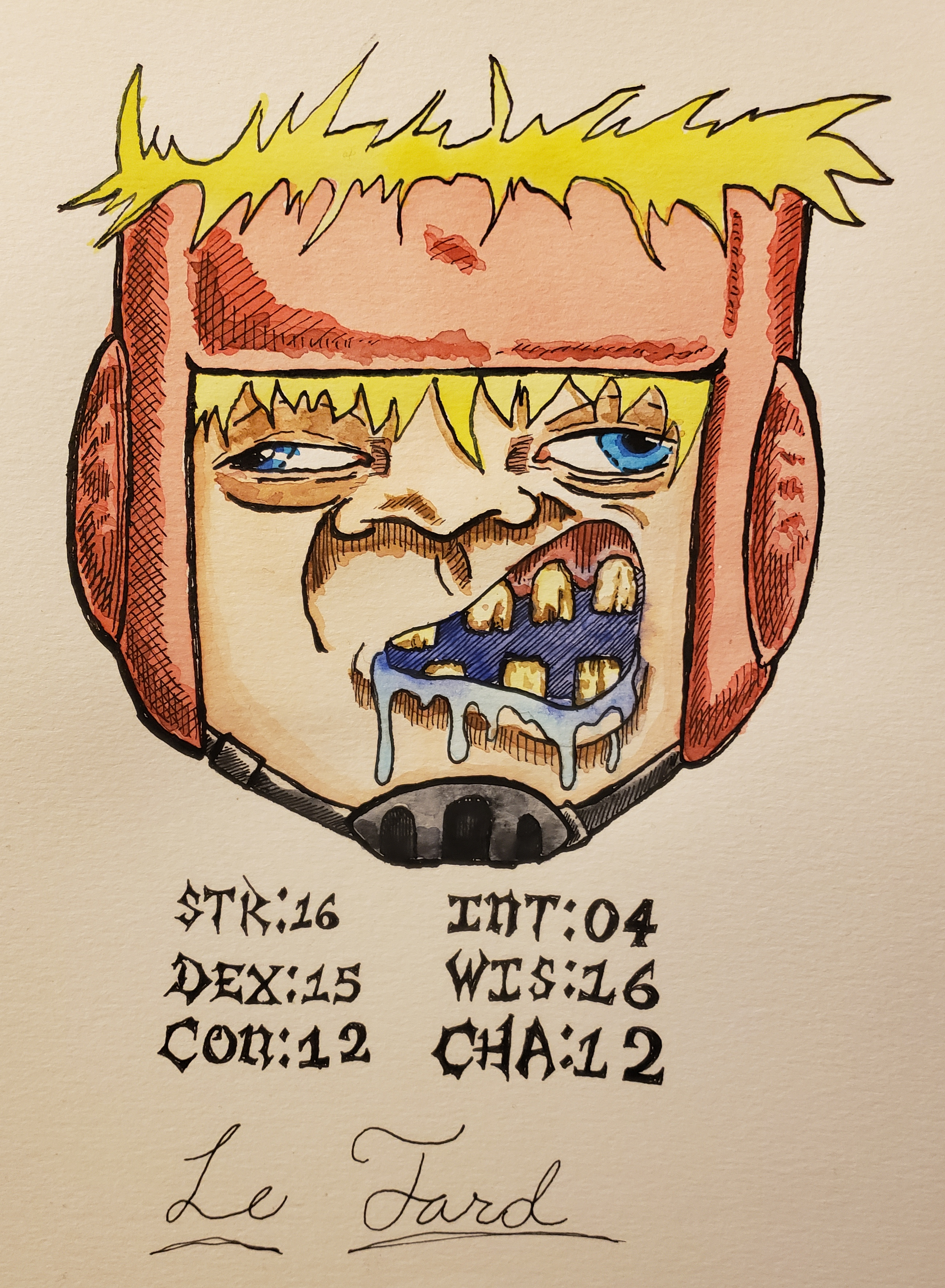

SEXECUTIONER: 
This is another one of my personal favorites. The recently made cuttlefish
 "fun toy” is on the border. There are so many things in the border I don't 
wanna spoil so I'm just gonna let you find them. I like the limited colour 
palette between the background and border. I wish I made the red behind 
the rose petals slightly darker/velvet to give Sexy a more lustfull feel. 
Sexy himself couldn't have come out better, I love and cherish him.


SAWBORG: 
The only thing I wish I could fix is the fact one of the iris’s are squished. 
The saws on his head look slightly crunchy, but it doesn't really bother 
me that much. Honestly, this one came out almost exactly how I wanted 
it to. The background is also vaguely based of 
his chest when it gets fuckin ripped open.


CUTTLEFISH OF CHTHULU: 
Honestly, there's nothing bad to say about this one. I love her empty s
mile and lil buggy eyes. Wait, no, there is something bad to say about 
this one. SMUDGES. Both from the tongue and seaweed. Listen, I've 
got big gross monster hands, you can't blame me.


PUSTULUS: 
I wish I had made the cavities of the sabers skull a little darker to add 
more depth. The chest was so fucking diffucult to sketch out and ink 
without my brain short circuting. I also wish the pimples came out a 
more vibrant yellow as opposed to the unripe lemon colour. 
I do, however like the irritation.


JIZMAK DA GUSHA: 
For some reason, the body is WAAAY lighter then i would like. I generally 
don't like browns all that much, but I stuck to the palette pretty well. 
Expression and eyeball are based off something I drew on the side 
of a box I sent to the slavepit a while ago.


BEEFCAKE THE MIGHTY: 
Oh boy. This is just plain embarrassing. So a lot of things were done wrong here. 
I was getting work done while extremely depressed, my passion was basically 
nonexistent, and I was rushing. So, right off the bat I made the helmet too 
light. For some reason, i remember being pretty afraid to make it darker so it 
stayed light as fuck. I also placed the shading layers WAAAAY to close together 
so shiding is pretty fuckin abrupt. I started running out of paint on one 
of the sausages so one of them is just jankey as fuck. 
Kids, don't feel obligated to work when you're sick.

NEXT WEEK TUNE IN FOR THE FINAL EPISODE 
OF DUM DUM'S GWAR-ITIATIVE!!!

Have you read the other episodes yet? 
Yes? No? 
Click The Links Below!

Friday, October 21, 2022

Yeah But Is It GWARt? Part III HOME INVASION

As mentioned at the end of last Friday's GWARt post Dum Dum was going to visit and show me the ropes of watercolour painting. There was only one other time in maybe 2008 or 2009 when I bought a cheap as hell Sumi INK Set with a brush that shed so bad I would hate using it and just gave up. I was more into painting Warhammer and WW2 army men at that time. So until 2022 I was dealing with acrylics. 

We didn't have much time since we were going out to eat as well as watching 2 GWAR films back to back that day. Of course we Overplanned like idiots, watched only IT'S SLEAZY and to add insult to Injury, Dum forget her fucking Pizza Slice in our car, so I ate that shit with green pepper hot sauce from Cholula. That was my reward for her SCREAMING at about 1,000 Decibels in my left ear for reasons I now forget. So we did our painting session, I drew one of the kids I used to see bouncing around the hallways in elementary school down the Special Hallway across from the Dean's Office. 

This session felt almost like colouring digitally except for when I would have too much water and it would bleed into a spot I didn't want it to. I am using one of those Water In The Handle Brush Pen Brushes from Sakura (the Microns motherfuckers) and their Koi Watercolours Pocket Field Sketch Box. The first thing Dum says when I open the palette is "You can tell this is old because the bricks are cracked" fucking elitist JERK, but she was right it was like unused for 9 years in my room back in my Brooklyn Days.

I caught on quick, absolutely hated the drying times and had to soak up colours with a paper towel because I kept trying to go at the speed I am used to with Acrylics and Digital. It does not like that and bleeds. I am so used to colouring things from the Mid Tone and then shading, and finishing off with Highlights. This you have to go from High Tones down to Low Tones, layering and layering and blending and layering. A little awkward but fun nonetheless. 

AND IT BEGINS...


Dum Dum: I would like to preface, this IS NOT my character. This is fanart based off an old Matt Maguire comic. With that being said, let's get into it!

Put down the base coat. This is pretty self explanatory, put down all the paint on the inside of your lines. If you like to lay all the base colours first go ahead n do that! I personally like finishing one segment/re-occurring colour of shading before moving on 


Beefus: I sketched super fast, did lineart with my Pilot Metropolitain Fountain Pen until she whipped out her PH Martins Ink and I had to break out my calligraphy pens instead, a good choice. I wasn't used to creating skin tones yet so I went straight for base colours on helmet and hair instead.


Dum Dum: So what happens next is slightly darkening the colour you just painted with a little bit of black (don't forget to test out the paint on a separate sheet of paper so you can adjust it to your liking). So you've done this, now you need to imagine where your light source is coming from. Where the light will fade away and darkness is starting to become prominitae is where you start to layer on. Its a little easier to understand what im saying by looking at the image below. Id imagined the light was coming from the top down so the darker areas would be near the feet, bottom of the belly, chin, and some of the upper head/forehead. REMEMBER this is your lightest bit of shading right now, so don't be afraid to let it really cling to everything!


Beefus: Once again played it safe and just buttered the teef, coloured the Drool, and Irises. 


Dum Dum: Repeat this process now, but going a little deeper into the shading you had previously laid down. There's no need to add more black due to the properties of watercolour it will automatically make itself darker.


Beefus: Dum had a special tube of Burnt Sienna which she would mix with the tiniest bit of Red, I of course messed that up on my first try, but landed a decent skin tone on my second go round. I somehow shaded by accident on his left eye (his right eye). I added the pink on the gums first, then the eye corners, and finally picked purple for the inner mouth which of course pooled up without me noticing, and when I blew on it the colour spread, and after sopping it up the damage was done. At least the helmet and chinstrap shading looked fine.


Dum Dum: I had decided 3 layers of shading was enough for the body so i moved onto the blue armour parts. The same process as detailed in rule 2-3 is being applied here.


Beefus: I honestly should have left my shading at this, but of course I didn't. Added brown rot to his tooth cracks for the extra BAD BREFF. Another layer on the red although its barely noticeable. A little bit of the stupid inner mouth purple got on the side of the mouth, looks like a bruise. Maybe he has really bad depth perception and forked himself in the lips?


Dum Dum: Shading for blue armour parts and fuzzy skin is done!


Beefus: As I said on the previous version I really wish I left the fucking skin shading alone, its just too dark here, big mistake, looks kinda dirty but then again maybe that is a good thing? I did my final reds on the helmet, and I think I touched the chin strap again, which it didn't need. I notice I really need to think through if I need to shade more or not, there is no Undo Button, but hey you wont know unless you go too far so its ok. OR YOU COULDA TESTED ON ANOTHER FUCKING PIECE OF PAPER. 


Dum Dum: Blood time! Blood can be a little tricky to mix but this is usually what i do. Human blood actually has a HEX code! #880808 is the most accurate colour of blood outside our body. So pull that up and try to mix accordingly. What is find is the absolute best is a LOT of red and some amount of black. When you layer on blood, its not transparent like usual watercolor so you want it to almost look solid by adding as much pigment as you can. Blood gets no shading with me, but you can totally do it!

For the blood in the fuzz, I used a sponge (if you cant afford fancy sponge, get a kitchen sponge you're willing to sacrifice) soaked in the same colour as the blood covering him and squeezed out most of it. Then with the little bit you have, dabbed the areas i wanted to have the dried matted bloody fur affect. Same was applied to the teeth and tongue,  but with a streaking motion.

Splatter was done by sopping up some red with the brush, pulling back the bristles, and letting them go. If you dont mind your aera getting messy this is a really fun method to try!


Beefus: As a finale we thought it would be funny to roll up his 6 Attributes, Dum had brought really tiny dice in a glass bottle so I rolled the D6 and he got some crazy ass stats! Le Tard was born.

Dum Dum
Things to remember:
- You can only layer on top of watercolour, highlighting is basically nonexistent without mixing mediums. (which is totally fine!) 

- This is my personal style that took awhile to develop, feel free to experiment and make something way better!

- The type of paper I like is Canson watercolour paper. It is thick as hell and perfect for this style since it breaks down at a lower rate unlike mixed media paper.

- The kind of watercolours I recommend getting are Winsor And Newton value packs, especially if you are first starting out. They have a decent amount of pigment and are pretty cheap.

- There are certain types of brushes for watercolour, but I really don't have a problem with just using general brushes.

CONGRATS!!!! You finished your little boy! Pat yourself on the back and rejoice in pride! If you followed along with this tutorial, feel free to Dm me your finished product! I hope this was at least a little bit helpful in assisting you in your painting endeavors!

Beefus: In Conclusion, it was fun to actually hang out with a person and do some art together. Maddy was there too just sketchin' in her sketchbook since she really dislikes to paint. 

Have you read the other episodes yet? 
Yes? No? 
Click The Links Below!

Friday, October 14, 2022

Yeah But Is It GWARt? PART II

Now It's Time, Almost Time For Another Installment Of Derelict Dum Dum's GWAR-ITIVE Book.
Another Batch Of The Seemingly Endless Universe Which GWAR Produces On A Daily Basis Is 
Presented Here As Is Her Thoughts On Each Piece. Little Easter Eggs Pop Up In This Batch. They Will Make You Laugh, Cry, Shid N Pizz. 

In This Batch You See Her Borders Improve As Well As Anatomy, Although At Times A Bit Wonky Here And There. I Was Actually Speaking To Her During Bonesnapper Over Instagram So The Finale Is Extra Special For Me. Around This Time I Began To Learn Her Process And What Her Plan Was For Her Artbook.

And Since Then I Have Met Her In Person And Witnessed Each Artwork (On The Thickest Fucking Paper I've Ever Seen) With It's True Vibrant Colours. The Camera Unfortunately Degrades The Quality Really Bad. On The Next Post I Will Reveal The Presents She Bestowed Upon Myself And Scalenepumpkins!


BABY GOR:
The pastelle issue is mostly fixed. I just wish I had made his skin
a slightly darker/more vibrant green. Other than that, I fucking love
this picture so much. I feel it's extremely accurate to the
newer lil fella.  The old don sculpt is also in the background.


MR. PERFECT:
Immediately, you can notice his eyes and mouth are slightly wonky.
Due to this, it looks like he has had a stroke. Border is supposed
to be lava rocks with magma occasionally peaking through the
gaps but it doesn't really come across as such mostly due to the
pastelle issue. Other than that, I feel I portrayed his vibe
pretty well with the lettering and tentacles.


Dr. Mr. Mrs. Prof. SkulHedFace:
Something about her eyes are way too off/creepy to me.
Generally I don't like this one, I just REALLY cannot get behind it for some reason


THE MASTER:
There is NOTHING I don't like about this. This is the one I fucking nailed!!
From the font to the background, to the shading, I love it all! Sawborg is
on the screen flippin ya off and the keyboard says “FukU” in the 3rd row of keys.


HIM:
Another glaring case of the pastelle issue. I also hadn't  had a
lot of experience with mixing skin tones at the time so I was
extremely cautious to the point where it impacted my better
judgment. The news clippings to the left side read His name
as “Bobert Zypgski” I now realize I spelled ZipperPigs last
name wrong :). The news clippings to the right say “lol you are gay Bitch”.


WORLD MAGGOT:
Pastelle issue AGAIN is apparent. The depth to his mouth is pretty
good in my opinion though. Not much else to say.


BONESNAPPER:
So some explaining is necessary. There as you might be able to tell
is a big jump in quality. That's when I took a huge break to brush up
on my painting skills (pun intended) and god damn I came out the
gates swinging with this one. I couldn't be happier with his skin
colouring. The only thing I would change is the pattern behind him
to have a tarnished gold look.


That concludes today's broadcast!


NEXT WEEK's POST WILL BE:

Dum Dum Will Be Coming Over For An Afternoon Of GWAR Films (Phallus And It's Sleazy)
And Will Be Teaching Us Her Method Of Watercolour Painting!
So Be Sure To Check Back For A Nice Big Post Documenting That Experience!

Have you read the other episodes yet? 
Yes? No? 
Click The Links Below!

Friday, October 7, 2022

Yeah But Is It GWARt?

THIS IS PART 01 OF A MULTIPART SERIES!!!!!! 
CHECK BACK FOR MORE SOON!

On a perpetual quest to find things which are interesting, unique, and amuse me I sometimes come across a person doing cool shit. This is one of those times. 

In a world of instant gratification bombardment, very few people actually take the time to hone their craft, take in every lesson, and strive to become worthwhile. I met a GWAR fan recently on Instagram called Derelict Dum Dum who is currently creating an artbook. A one off artbook showing off her improvements, experiments, and love for GWAR. Illustrating character after character. But the real kicker is it will ONLY be sent to the Slave Pit as a statement of not only her love for GWAR, but how by drawing their characters it helped her improve with each page. And in a world of constant Side Hustles where nothing can just be done as a labour of love, this struck me.

With a rough beginning it steadily climbs into her own style, which is what she was trying to find throughout this process as well. A mix of Inking and Watercolours you can tell it's her artwork right away. Most GWARt I see concentrates on being overly detailed and can become a cluttered nightmare, where her style allows the character designs to faithfully shine though in an albiet rounded way, which honestly reminds me of 25 cent toys from a local supermarket (remember the rubber ninjas?!). 

A part I feel shines here is her border work on many of these, giving context to each character's personality. If you check her Instagram you can see some more recent ones such as Sexecutioner who has a hilarious border. The colour choices, the softness, the cartoonish nature, the borders are all part of a cohesive style that is unmistakably hers. 


Below we have the first batch of Artworks (I will be featuring the entire book here) along with her own Captions/thoughts on each artwork.


SLEAZY P MARTINI: 
Could have made the shading in the face/ jacket a little more darker, 
this is a common problem as this book was made when i was just 
starting to use watercolor. I also forgot his ears. 


GOR-GOR:
Shading is basically non-existent in this picture. 
The void in his mouth also faces the pastelle issue. 
Smudges on the side were done in a fit of rage after 
spilling watercolor on it, def a bad choice in hindsight.


TECHNO DESTRUCTO: 
Pastelle issue is extremely prominent. 
Coulda done the hair more whispy-ish. 
Pose is kinda static. Other than that, not much to say


DICKIE DUNCAN: 
Also falls into the pastelle issue. Grease color could have been a lot 
darker and grime-y in general. I also hate the matching border and background, 
more could have been done like fries, soda, hot dogs, nuggets. 
A Lot of wasted potential here. I do although love the burger lettering


BOZO: 
Pastelle issue is almost fixed here, but not gone. 
Shine effect with the mine shoulder pad and neck wrap could 
have had more depth to it. More rust should have been added to the bolts. 
The clown/ junkyard circus feel was conveyed perfectly here.


SLAVE: 
no. no. no. this one. I loathe this, there is so much wrong with it.
For one, i didnt know what the slaves of gwar looked like at the time.
I thought matt was the only one so i was completely oblivious
to maggot or muzzle slave. The background and border are just plain lazy
and under-decorated. Facial expression looks like some goofy ass
Quandale Dingle shit, as well as the open mouth effect.
The only redeeming thing about this are the hands and skin shading. Also crab tattoo.


MATTRON:
Pastelle issue is also fixed here, but not completely gone. 
Everything gets kinda cluttered near the gauntlet and lettering. 
Should've given Matt more chest hair and blood. This is the first one I like! 
The running/ splatter of the blood patterns all look natural and organic. 
And the helmet is pretty true to the real sculpt. Also crab tattoo


CARDINAL SYN: 
not much to say on this one. I just feel neutral on it. 
I think there were some formatting issues with his face because he looks like a bug.

Remember to check back for the next post with another batch 
of artwork and watch as her progress develops over time!

Have you read the other episodes yet? 
Yes? No? 
Click The Links Below!